Course
This lesson is part of a course that teaches you how to build a New Relic application from the ground up. If you haven't already, check out the course introduction.
Each lesson in the course builds upon the last, so make sure you've completed the last lesson, Add pie charts, before starting this one.
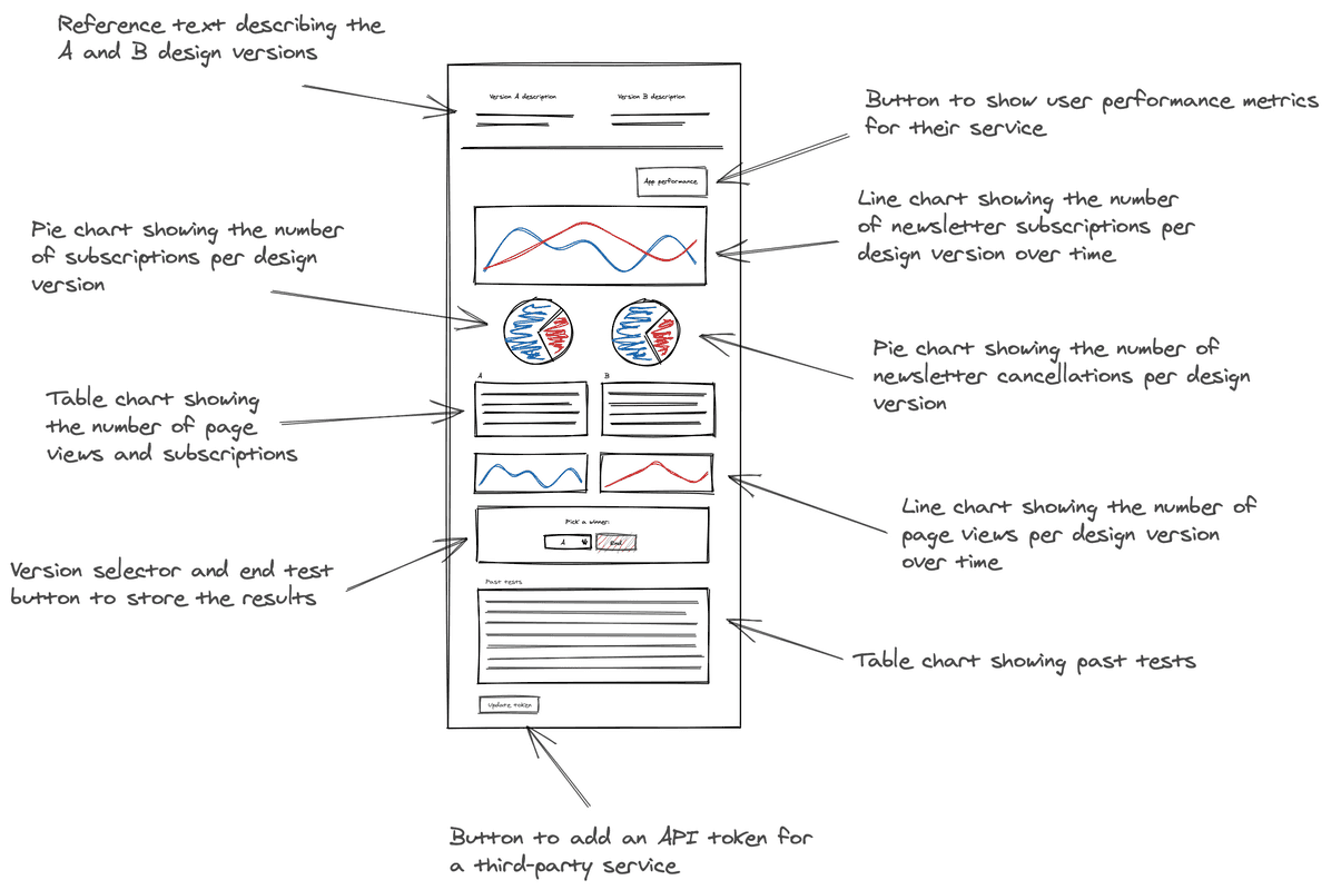
In each hands-on lesson in this course, you have been adding something new to your A/B test application. You’ve spun up a new launcher and added multiple chart components to your Nerdlet. In this lesson, you’ll create two new TableChart components that display information about each version of your website, such as the ratio of customers who subscribe to those who unsubscribe. Review your design guide to understand where these tables will fit into your application:

In this design guide, the TableChart components come after the pie charts you created in the last lesson.
Change to the add-tables/ab-test directory of the coursework repository:
$cd nru-programmability-course/add-tables/ab-testThis directory contains the code that we expect your application to have at this point in the course. By navigating to the correct directory at the start of each lesson, you leave your custom code behind, thereby protecting yourself from carrying incorrect code from one lesson to the next.
In nerdlets/ab-test-nerdlet, add a new Javascript file named totals.js:
$touch totals.jsIn this new file, create a component called VersionTotals to hold your first TableChart and some mock data:
import React from 'react';import { TableChart } from 'nr1';
export default class VersionTotals extends React.Component { constructor(props) { super(props); }
render() { const versionATotals = { metadata: { id: `totals-${this.props.version}`, name: `Version ${this.props.version}`, columns: ['name', 'count'], }, data: [ { name: 'Subscriptions', count: 0 }, { name: 'Page views', count: 0 }, ], } return <TableChart data={[versionATotals]} fullWidth /> }}TableChart is different from PieChart and LineChart in three big ways. First of all, there are no color or viz metadata attributes in its series. TableChart has a standard visualization, so it ignores things like color, which don't apply. Second, the TableChart series have columns metadata attributes. columns determines the names of the columns on the table. Finally, TableChart series data use neither x nor y values. Instead, they use keys that match the table column and values that determine what goes into the row.
Notice that VersionTotals takes a version prop and supplies it to the chart metadata's id and name fields. This allows you to use this same component to create a table for version A and B and eliminate duplicate code.
In your Nerdlet's index.js file, import your new component and update your Nerdlet's render() method:
import React from 'react';import NewsletterSignups from './newsletter-signups';import TotalCancellations from './total-cancellations';import TotalSubscriptions from './total-subscriptions';import VersionTotals from './totals';
export default class AbTestNerdletNerdlet extends React.Component { render() { return <div> <NewsletterSignups /> <TotalSubscriptions /> <TotalCancellations /> <VersionTotals version='a' /> <VersionTotals version='b' /> </div> }}Navigate to the root of your Nerdpack at nru-programmability-course/add-tables/ab-test.
Generate a new UUID for your Nerdpack:
$nr1 nerdpack:uuid -gfBecause you cloned the coursework repository that contained an existing Nerdpack, you need to generate your own unique identifier. This UUID maps your Nerdpack to your New Relic account.
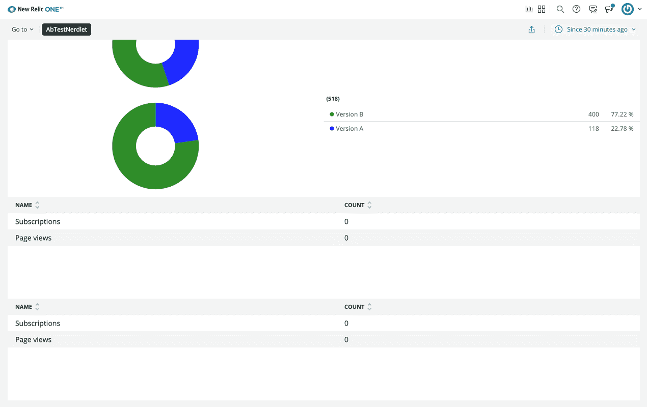
View your changes in New Relic:

Here, you see the TableChart components displayed in your application.
When you're finished, stop serving your New Relic application by pressing CTRL+C in your local server's terminal window.
Extra credit
There is one more table in the design guide that records past tests. The columns for this table are:
- End Date: The end date for the test
- Version A Description: A description for version A
- Version B Description: A description for version B
- Winner: The version selected as the final design
Try to build this table in your application with these column names and some fake data, without looking at a code sample. This practice will reinforce what you've learned in this lesson.
If you need help, review the add-a-chart-group directory of the coursework repository, which corresponds to the next lesson in this course. This has the code for the PastTests component.
Each chart you’ll add to your application throughout this course is unique in its type or in the data it presents. So far, you’ve created tables, pie charts, and a line chart, and they all function independently of one another. In the next lesson, you’ll create a couple more line charts, but this time they’ll function together.
Course
This lesson is part of a course that teaches you how to build a New Relic application from the ground up. When you're ready, continue on to the next lesson: Add a chart group.